Yogurt Mill
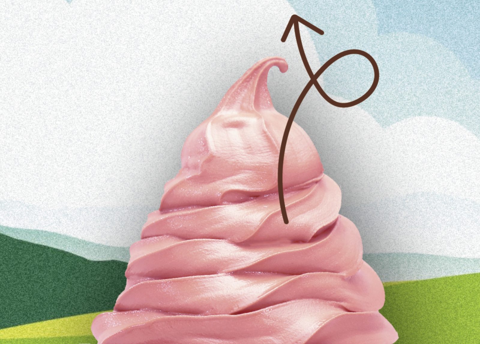
Swirling happiness
Background
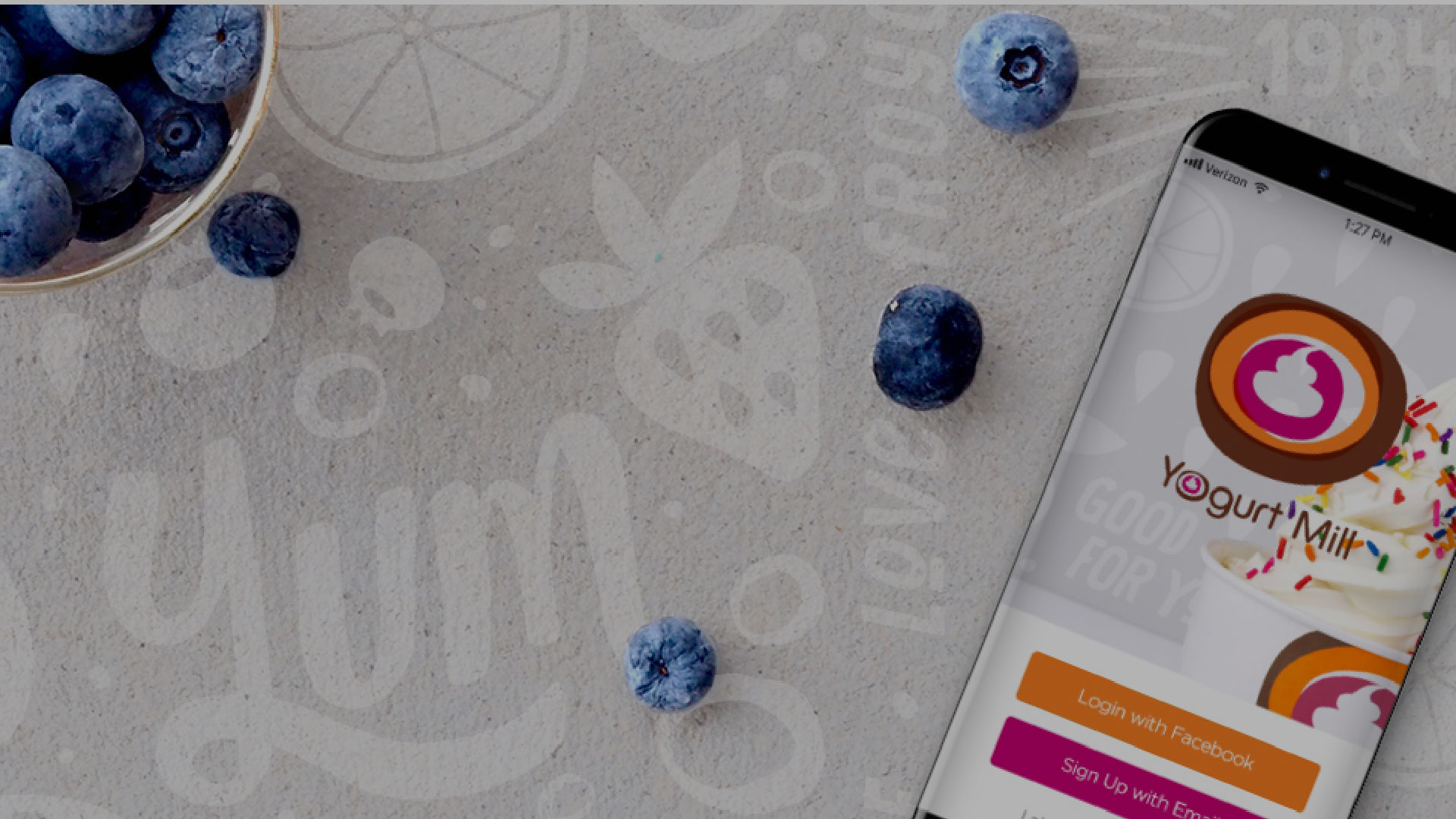
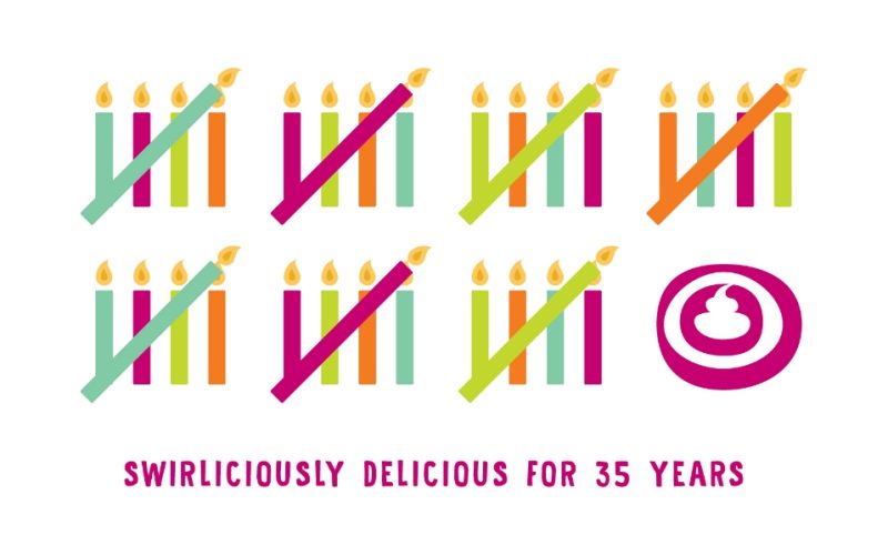
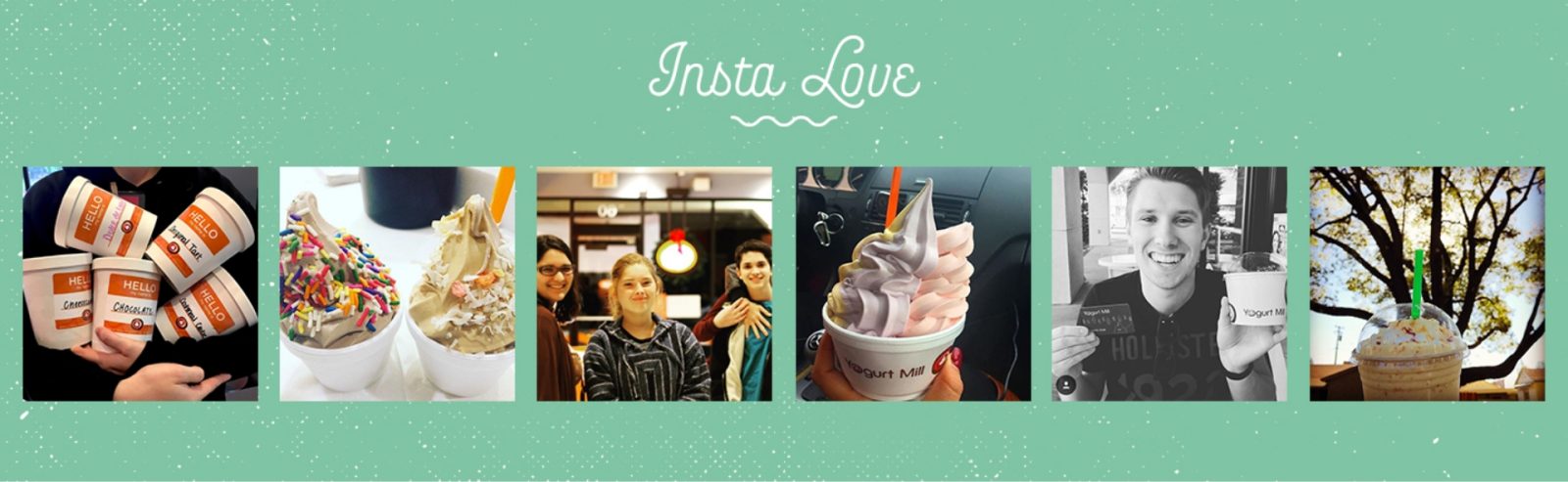
Fervor has worked with Yogurt Mill for almost twenty years. We began with their logo which has required simple type enhancements lasting the test of time. We’ve built a range of secondary marks for their internal Swirl Squad and various packaging and environmental patterns. Staying fresh is as important for their brand as it is their amazing soft serve!
Challenges
Keeping a brand relevant for almost 20 years requires creativity along with discipline. We’ve been a trusted partner in ensuring the brand is cohesive across a wide range of requests over the years. We respect the creative passion that the owner has for his product and strive to reflect that passion in everything that we create.
Solutions
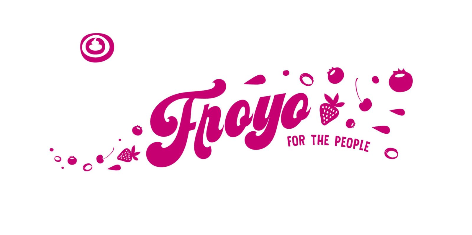
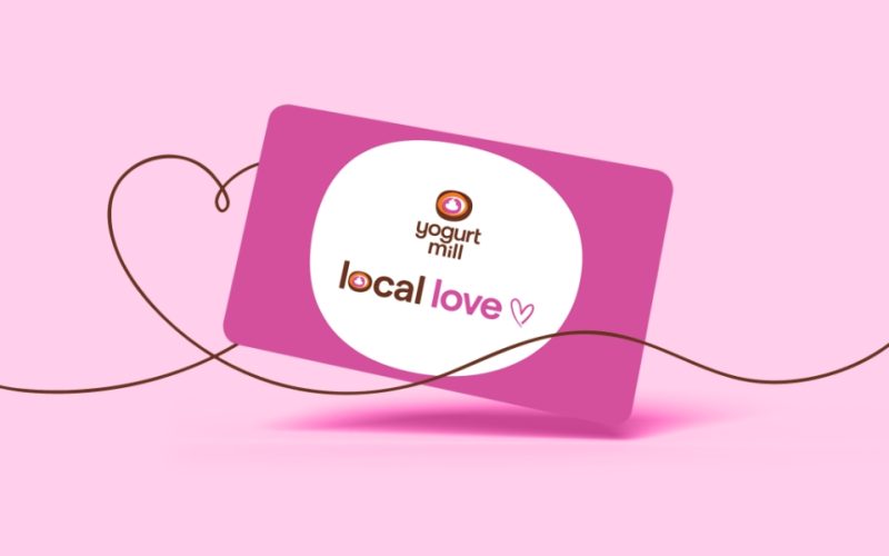
The logo and color palette has remained true over the years keeping consistent brand recognition for their loyal and new patrons. We have built a range of patterns and typographic solutions that work on everything from large wall graphics to gift cards, digital marketing and packaging. We have ensured their tagline – swirling happiness – is felt in everything that we do for Yogurt Mill.
"Can’t thank you enough for the design you provided for our food truck. I just picked it up from the sign company and it looks amazing!"
LARRY YOUNG, FOUNDER